
Why are my images printing too dark?
If you find that your printed images appear too dark, it is unlikely that the issue is related to the paper or printing process used. At Colorfast, all papers are scientifically calibrated to accurately represent each color value on any given paper using ICC profiles. We employ the latest Barbieri technology, sophisticated calibration color software, and a dedicated RIP (Raster Interpolating Process) to ensure that every pixel is represented in print as accurately as possible. This process ensures that color values remain true once a paper has been profiled.

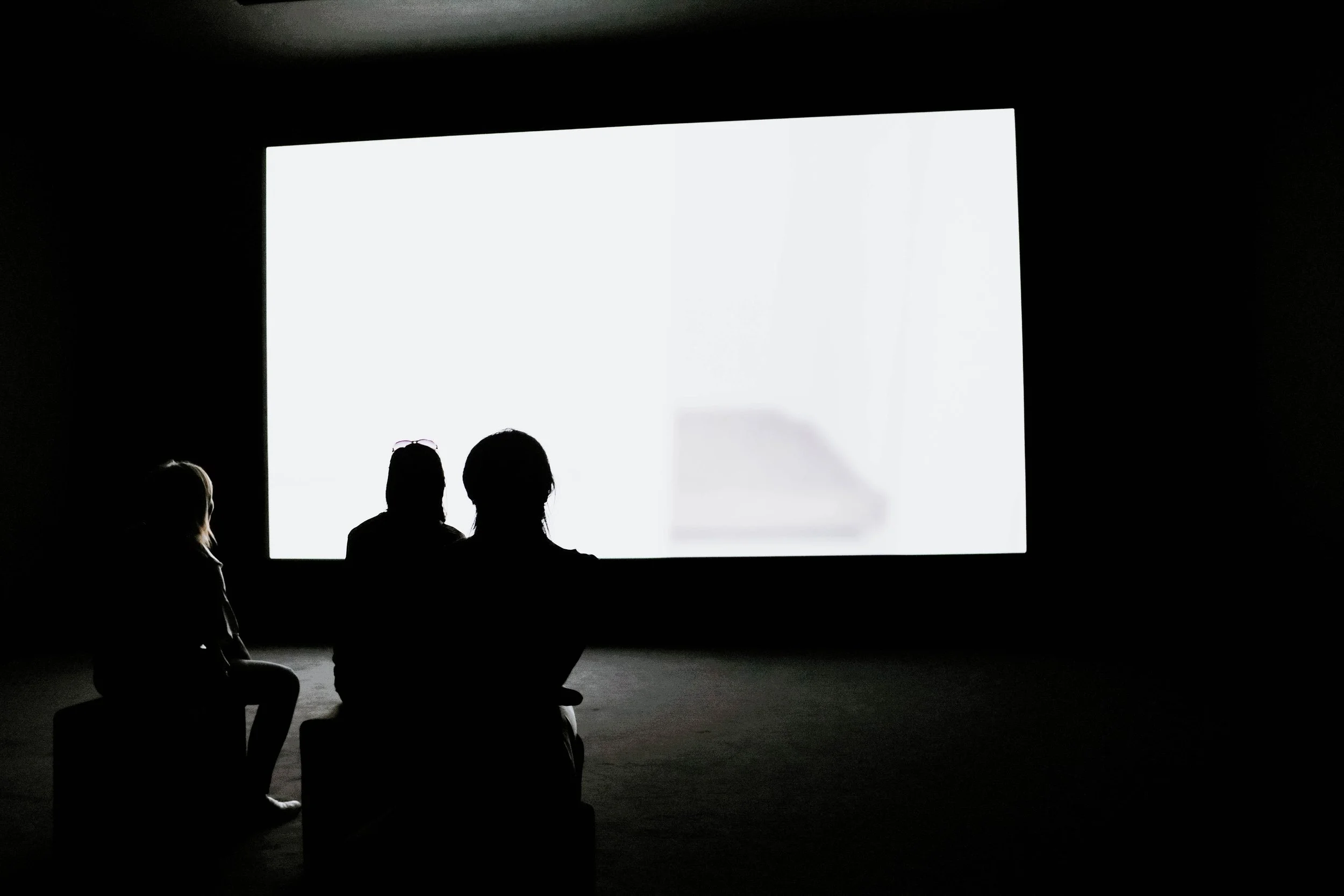
While the paper selection can impact how an image appears, these differences are generally smaller than the effects of selective edits made prior to printing. Textured or matte paper may have a lower dynamic range than glossy stock, but regardless of paper selection, an image that appears too dark will print dark on all papers. Typically, your screen will appear brighter than your printed image, see picture above.
There are also many other reasons your images could be printing darker than expected…
Screen brightness: If a screen is too bright, the images displayed on it will not accurately represent the original image. It is important to remember that the screen is merely a representation of the image and not the actual image itself. Adjusting the brightness on the screen does not change the image, but rather affects how it appears on the screen. To correct the screen's brightness, a simple solution is to ensure that the brightest white on the screen is no brighter than the paper you plan to print on (Whitepoint). Another option is to adjust the screen's brightness until it matches a sample print that you have already made, as this will give you a more accurate representation of the image.
Viewing conditions: In professional printing, prints are typically evaluated under simulated daylight conditions with a color temperature of approximately 5000 Kelvin and a Color Rendition Index (CRI) as close as possible to 100. This viewing environment is significantly brighter than an average living room. Therefore, when editing an image for print, it is important to consider the display conditions you are using to ensure that the final printed product accurately reflects the intended colors and tones.

Under Exposed Camera: Thanks to advancements in camera technology, underexposure is now less of an issue than it was in the past. However, it is still important to learn how to read a histogram and check your images in levels or curves using a program like Photoshop or your preferred image editing software. In many cases, an underexposed image can still be adjusted to print effectively.
Black point compensation: A screen has approximately 10x the contrast ratio of a print. That difference is most noticeable in dark areas where you can see many more “shades” on your screen than you can in print. A print does not represent the same dynamics in tones/shades as a screen. For this we need to compensate prior to going to print. This used to be called “darkroom skills” prior to digital printing. Dodging and burning is art form that still can be practised in Photoshop or by carefully working with HDR filters. Black point compensation is another an effective way of dealing with this issue. Below is a link to a great video showing how that works. If an image has a lot of information on the left hand side of the histogram the video will show how you can stop those shaded areas becoming too dark or defaulting to black. How much of this work that has to be done depends on the paper. A Matt or textured paper (light absorbing) will require a greater adjustment then a light reflective paper (Gloss).